📐 Overview
This page outlines the architecture of Administrative Workload Analytics—covering the business, IS, and technology layers—along with the data pipeline and entity relationships that power the dashboard.
Solution Architecture (Business / IS / Tech)
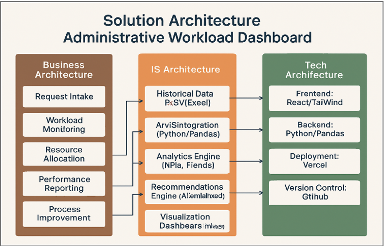
Figure 1. Business, IS, and Technology layers aligned to support the Administrative Workload Analytics dashboard.
Business Architecture
The business layer represents how administrative work runs at Silverleaf University:
- Intake of student or departmental requests
- Monitoring and tracking workloads across units
- Allocating tasks based on demand
- Reporting performance metrics to leadership
- Identifying bottlenecks for continuous improvement
IS Architecture
How information moves, transforms, and becomes insights:
- Synthetic historical data stored as CSV files
- Python ETL for cleaning and merging datasets
- Aggregation logic creating daily summaries per department/admin
- Recommendation logic surfacing trends (peak load days, request types)
- Visualization dashboards turning raw data into decisions
Technology Architecture
The tools, frameworks, and infrastructure:
- Frontend: React + Vite
- Styling: Tailwind-style utility classes and custom CSS
- Visualization: Recharts for interactive graphs and KPIs
- ETL & Data Prep: Python, Pandas, NumPy, Faker
- Hosting: Vercel for live dashboard deployment
- Version Control: GitHub for collaboration and dataset management
System Architecture & Data Flow
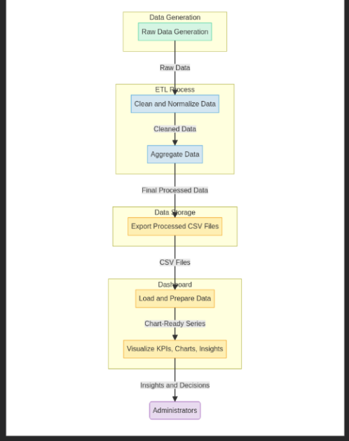
Figure 2. End-to-end data flow powering the Administrative Workload Analytics dashboard.
The Administrative Workload Analytics system follows a lightweight, client-side architecture. A React (Vite) frontend runs on Vercel and consumes pre-generated CSV datasets. All data is created, cleaned, and aggregated offline in Python before the dashboard loads it for visualization.
The synthetic dataset includes Requests, Admins, Departments, RequestTypes, and DailySummary files. React loads these CSVs at runtime, transforms them into chart-ready formats, and uses Recharts to present KPIs like daily volume, department workload, request distribution, and admin performance.
Client-Side Architecture
React (Vite) hosted on Vercel, consuming processed CSVs without a backend server. Business logic remains in the offline ETL pipeline.
Dataset Summary
CSV files for Requests, Admins, Departments, RequestTypes, and DailySummary feed KPI cards, charts, and filters in the dashboard.
🔄 Step-by-Step Data Pipeline
- Generate Synthetic Data: Python (Pandas + Faker) simulates realistic workloads, timestamps, request types, and admin assignments.
- Clean & Normalize: Fix missing values, format timestamps, normalize text, and ensure each request links to valid admin/department/request type.
- Merge Datasets: Combine Departments, Admins, Requests, and RequestTypes into a unified table.
- Aggregate Workload: Group by day, department, and admin to produce
DailySummary.csv. - Export Processed CSVs: Place cleaned and aggregated files in the project data directory for the frontend.
- Frontend Loads & Transforms: React parses CSVs, converts to JSON, and shapes chart-ready series.
- Visualization & Insights: Recharts renders trends, distributions, workload comparisons, and admin performance with filters and interactions.
With these aggregated insights, administrators can quickly see overloaded departments, peak workload days, high-volume request types, and targeted opportunities for staffing or process improvement.
ER Diagram (Entities & Relationships)
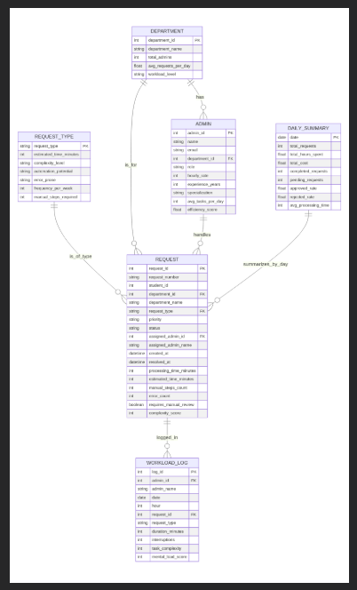
Figure 3. Entity-relationship overview showing how Departments, Admins, Requests, RequestTypes, WorkloadLog, and DailySummary interact to support workload analytics and dashboard insights.
The data model consists of six core entities representing administrative workload activity at Silverleaf University. These entities feed the aggregated dataset used by the dashboard’s KPIs, charts, and recommendations.
Departments
The parent unit; each department oversees multiple admins and receives different categories of workload requests.
Admins
Staff members responsible for processing requests. Each admin belongs to a single department but handles many requests.
Requests
The central entity representing incoming administrative tasks. Each request links to a Department, an Admin, and a RequestType, and stores metrics like processing time, status, and complexity.
RequestTypes
A controlled list of categories (e.g., Admissions, Financial Aid, International Services) to classify workloads consistently.
WorkloadLog
Action-level trace for each request (timestamps for verification, approvals). Supports deeper process analysis if expanded.
DailySummary
Aggregated dataset built during ETL. Summarizes volume, processing time, errors, and workload distribution per day/department/admin. This is the primary dataset used by the React dashboard.